
Brand new.
Brands are uniforms. They are the codes which define our image. They need to be firm and set, but at the same time provide the flexibility needed to be able to adapt to the various formats which they face in the world. Be it a business or a family event, the strength of the brand will determine the success and durability of the image.


Logo Creation
Creating a logo is the first step in building a brand. Understanding the client’s needs and getting a firm grip of what the needs and uses of the logo you are developing is the whole difference between a successful and a less fortunate one. Over the years, we have been entrusted with designing several logos… sometimes for a simple set of stationery, other times for a full brand development.

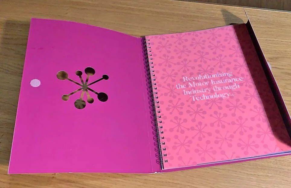


Aktuaris
Development of Logo, Company Brochure and basic stationery
The Aktuaris brand grew from a small start-up to a fully-fletched operation which assists insurance companies in the monitoring of its clients. Although the logo already existed, it needed to be cleaned up and brought more to life. The brochure was developed as a sales tool, which based itself alot on the colour palette of the logo, plus additional features such as laser cutting, hot foil, translucent paper and more. It was purposely designed as a stand alone tool which helped to explain the benefits of the software and how it worked in a simple, dynamic way.


Enemalta
Development of new logo and brand
In 2008, Enemalta - Malta’s energy corporation - decided to change its existing logo and image to reflect a much needed contemporary look. The brief was that of creating a new logo that reflected the company’s vision towards a more environmental approach. The new logo which apart from acting as a stylised letter ‘e’ is also very reminiscent of a green leaf. The branding exercise was taken to its full, with all the elements required, including uniforms, vehicle livery and more. The Enemalta brand is still active today.


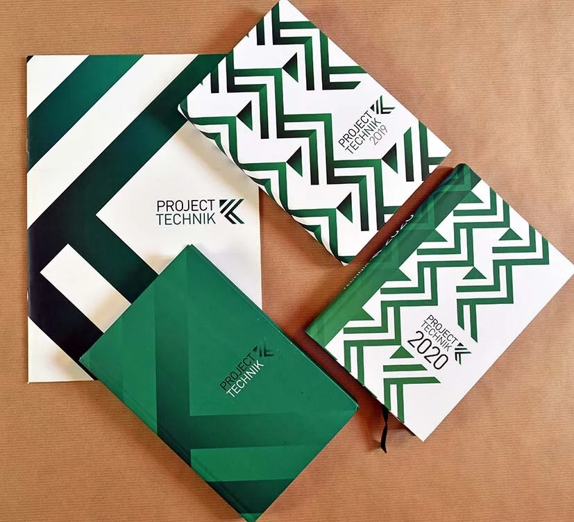


Project Technik
Development of new logo and brand
Project Technik is a local company that provides supplies to the construction and engineering industry, and also carries out turnkey contract works. The creation of the logo was based on the brief that the company had already built an array of clients over the years, and everybody associated it with the letter ‘K’. Hence, the new logo became a modern interpretation of the letter K, which also took on the connotations of an arrow, signifying direction and action. The original company colours, i.e. black and green were also retained not to depart too much from the past.


Cent’anni
Development of Logo and Menu covers
Cent’Anni is a quaint small restaurant and wine bar located in one of the narrow streets of Gharghur. The design of the logo was inspired from old signage and it was kept simple and purely text based to reflect the authentic simplicity of the place. The design of the menus was also inspired from original features of the place, including the floor tiles.


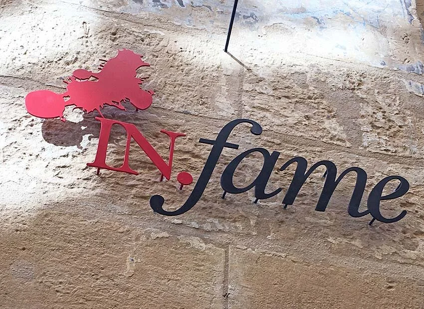
in.fame
Creation of logo and basic restaurant brand
The idea of the owners of this restaurant in Valletta was that of creating a place with strong links to the capital city. '‘Infame’ was in fact the adjective attributed to the renowned artist Caravaggio, as he was quite a troublesome character, accused of murder too. Hence the splash of blood in the logo. However, the fact that literally translated, in.fame means ‘full of appetite’, created a very strong link between the place and its role. Unfortunately, infame has been closed for a couple of years, but the logo and image created still remains a very treasured one.

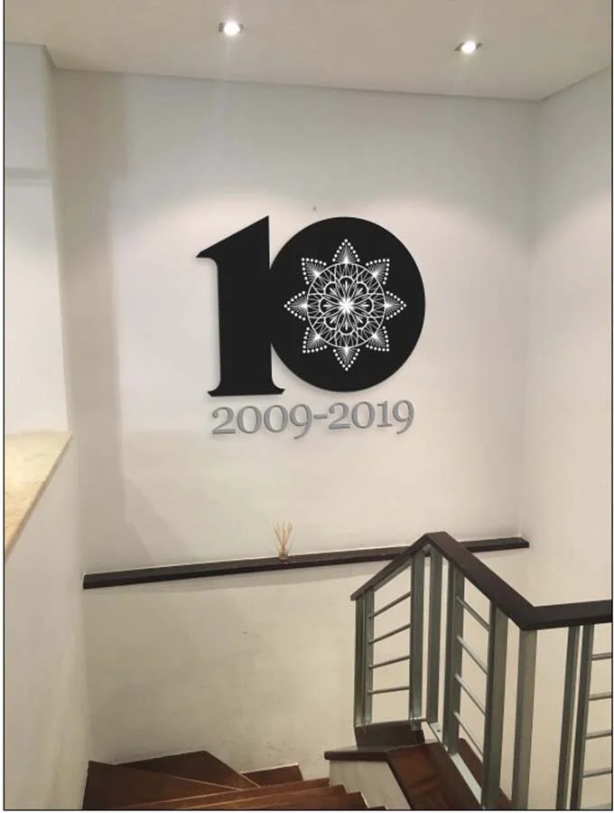
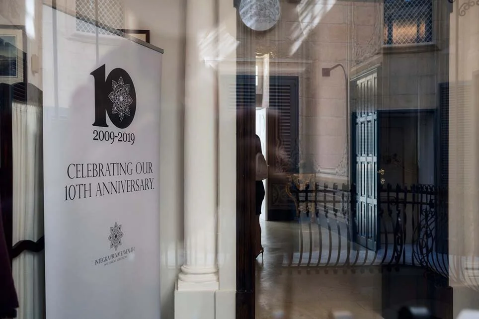
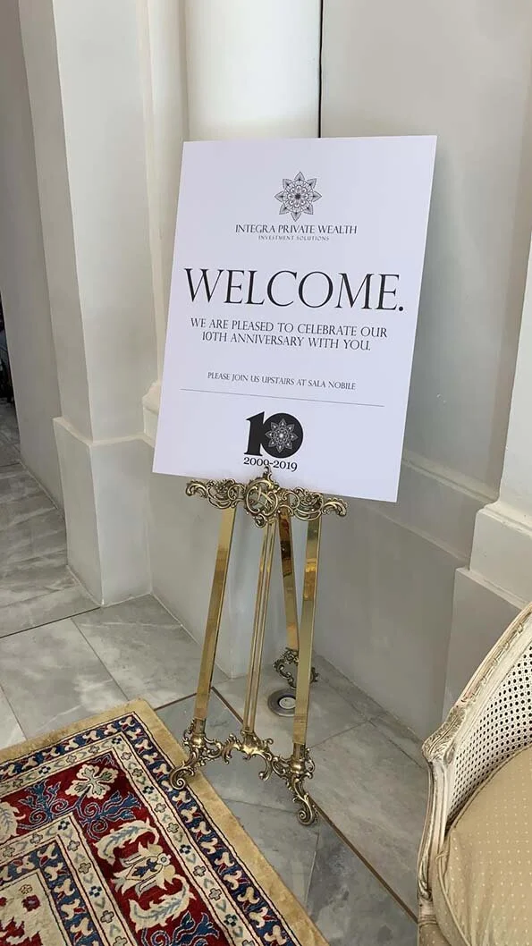
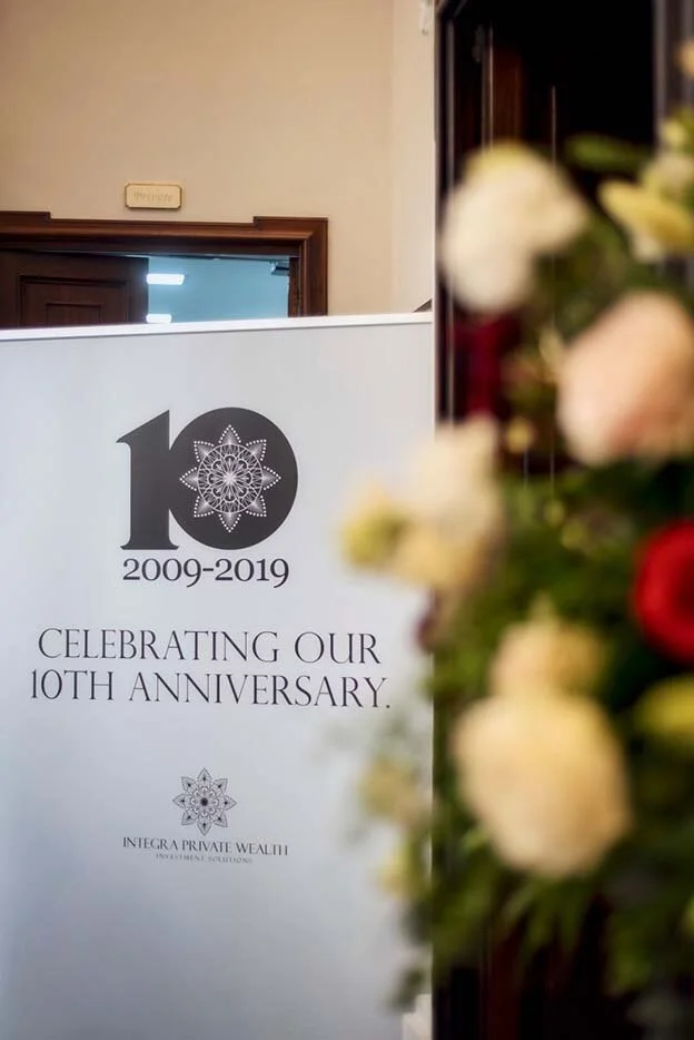
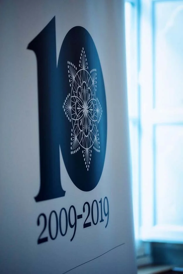
Integra Wealth Management 10th Anniversary
Development of logo and signage for event
Integra Private Wealth Management celebrated its 10th anniversary in 2019. For the occasion, the management felt the need of adapting their logo to commemorate the event, and so Box Design was entrusted with this. The logo was also used for a set of signage for an event that was held at an established hotel in Valletta.


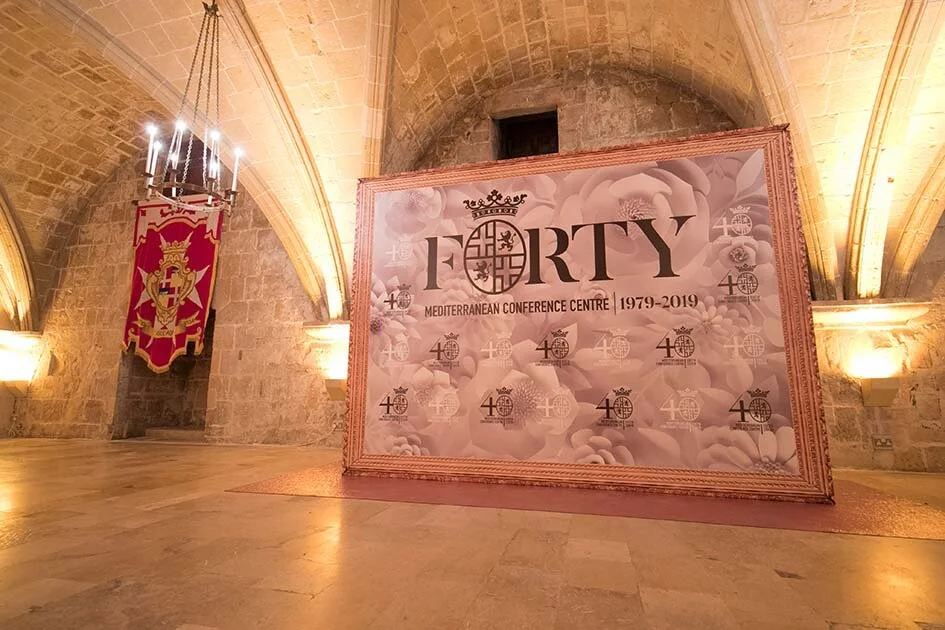

Mediterranean Conference Centre 40th Anniversary
Development of logo and branding (photos courtesy of MCC)
On their 40th anniversary, the MCC approached Box Design with the task of creating a logo that would represent this prestigious milestone. The logo was used on all the stationery, and on other material, including banners and signage for a concert that was held to mark the occasion.


Ta’ Gerit Café & Bistro
Design of logo and basic restaurant branding
The idea behind the creation of the ‘Ta’ Gerit’ brand, was that of designing a logo that represented a new and modern place, but with firm traditions. The logo was used for stationery, menus and signage.

Myanmar branding
Development of brand based on existing logo
When Myanmar organised the World Economic Forum in 2015, it needed to project itself in a professionally branded way. Thanks to Image Diplomacy, Box Design was entrusted with the full development of a brand that included a prestigious coffee table book, stationery items, t-shirts and many more items related to the anniversary.




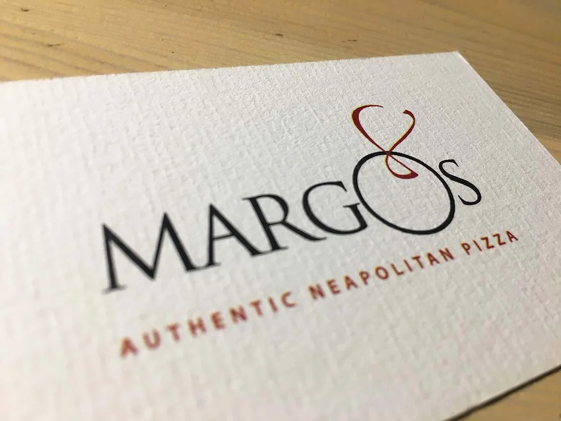
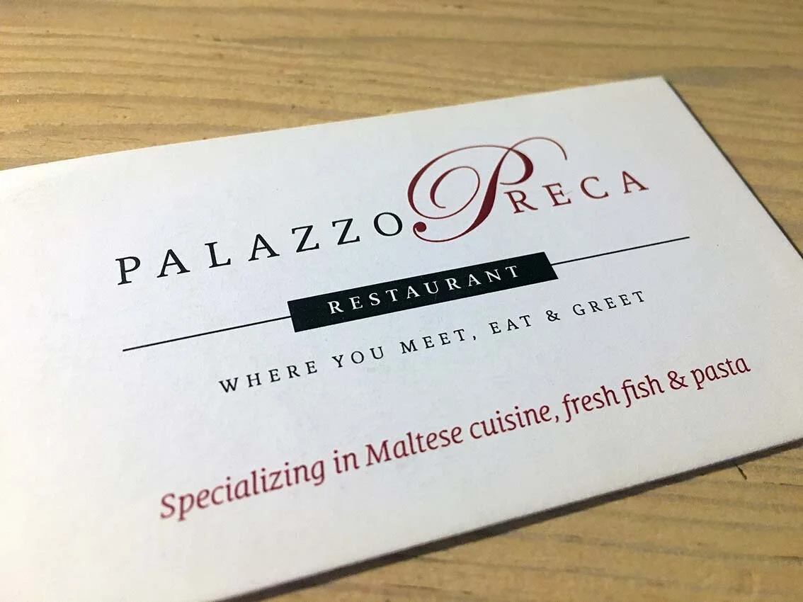


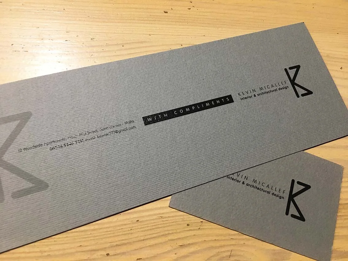

Various
We have designed several more logos and brands. Speak to us so that we can discuss your next project.
