
Ready, steady, pack.
Launching your product on the market is not a light thing. Make sure you address the right target, the correct audience. We believe we can give you what you want because we understand you.
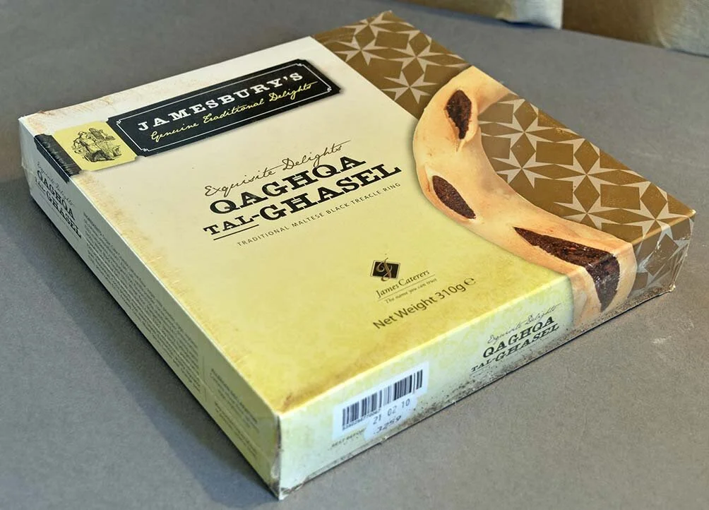

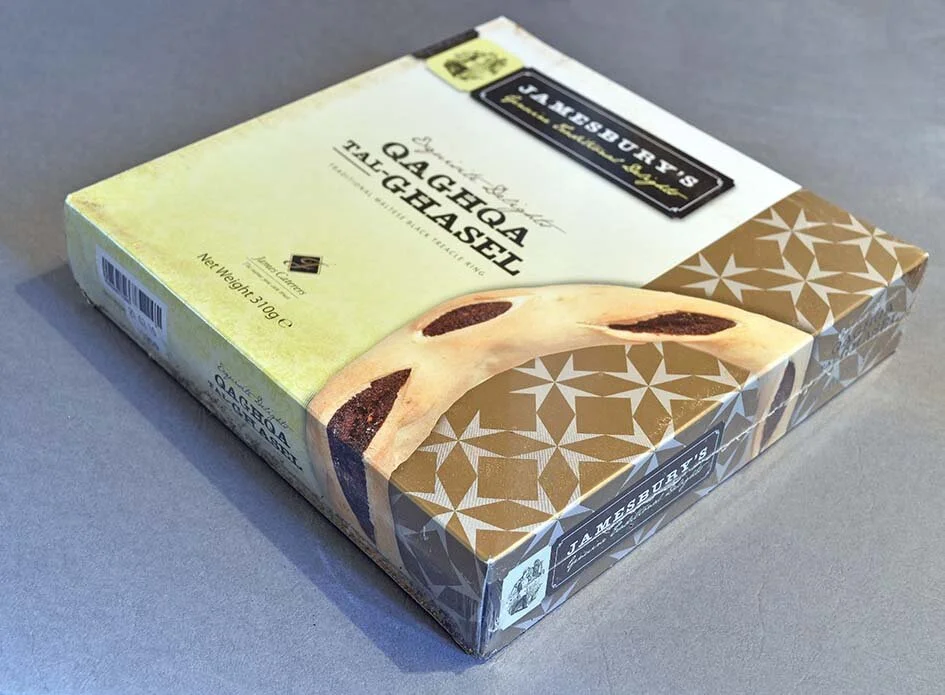
Jamesbury’s Honey Ring
laminated cardboard box, printed in CMYK + additional metallic gold
Jamesbury’s is a sub-brand of local catering company James Caterers. The limited range of pre-packed foodstuffs was created with the idea of not being different to the normal items produced by the same company, in them being a grade higher. Apart from the packaging, this job included also the design of the logo which was also used on other items, such as the pre-cooked meals range, and the biscuit range.


alimenti
Sealed bags with transparent window
Designing the Alimenti range was one of the most rewarding recent design experiences. The idea of creating a brand that represented healthy foods with an appeal for genuinity and natural benefits was translated into natural, uncoated bags, with a logo and colour range that instilled a natural palette, with colours derived from nature. The range of products is packaged locally by Dical House.


Fat Harry’s Pizza Box
Printed in 2 spot colours on natural cardboard
As part of the rebranding exercise to inject new life into the Fat Harry’s image, we had lots of fun dressing up this box in line with the rest of the imagery, menus and signage associated. Consistency in the colours, diversity of fonts and jolly messages make sure it is the eyes that eat first… Bon appetit!

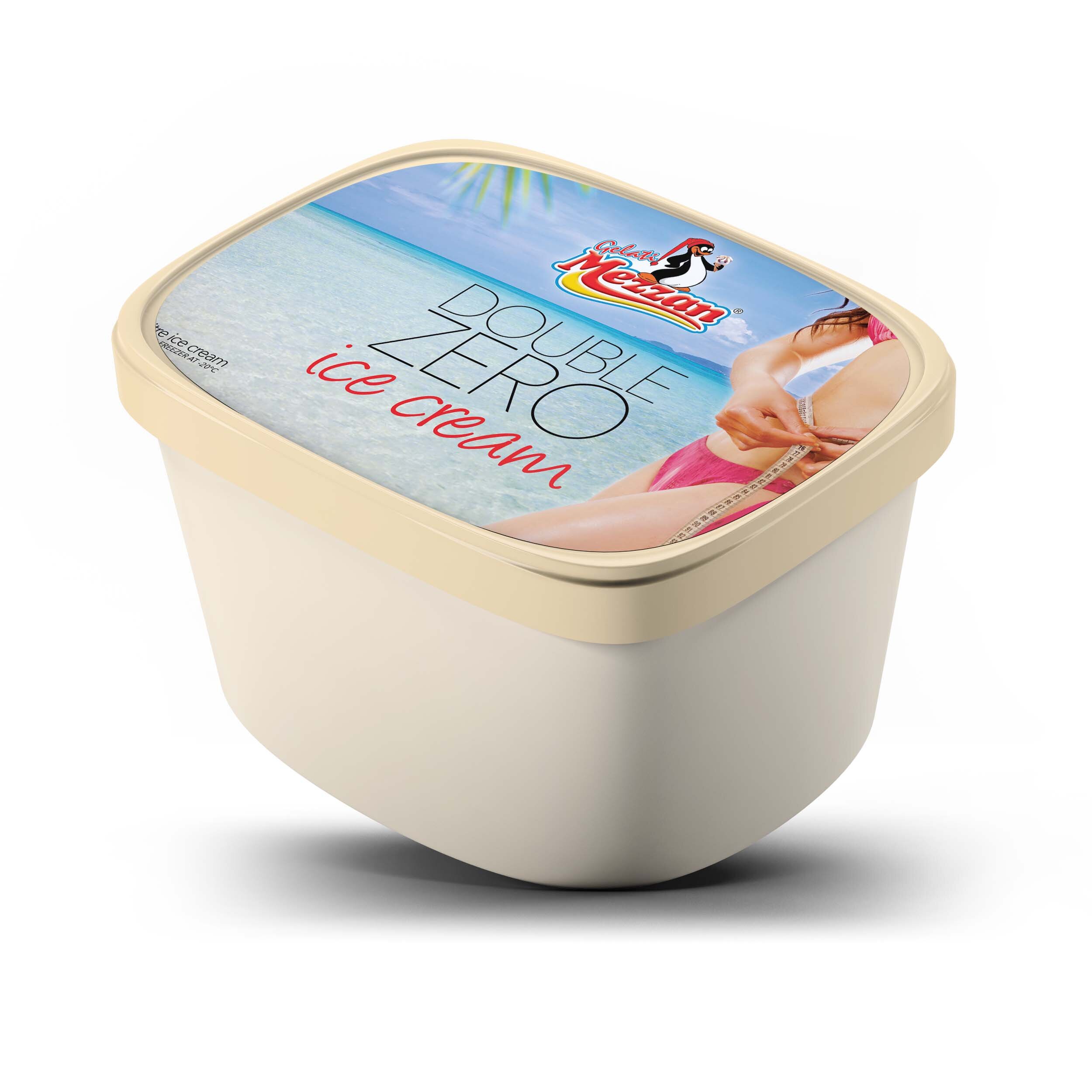

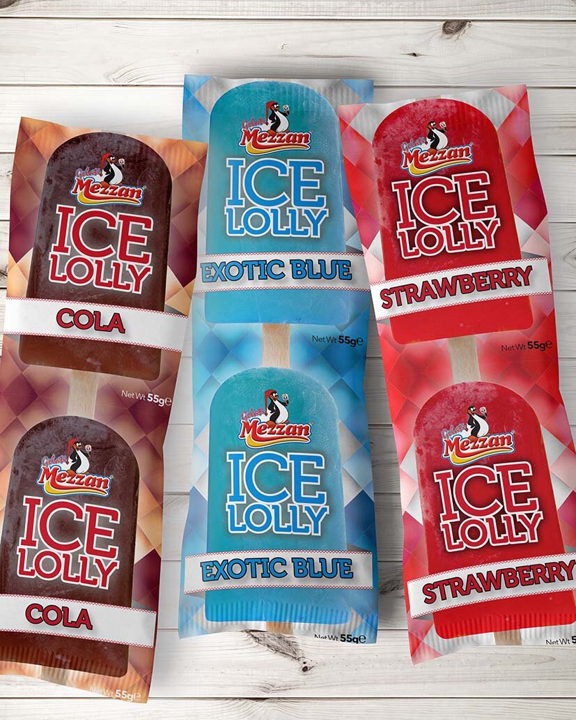

Mezzan Ice Creams
Various
Mezzan is a Gozitan ice-cream manufacturing company, which has in fact been around for quite a while. Over the last years, Box Design has been entrusted in re-creating the packaging for some of the existing products, with the scope of injecting new life into them, and also to try to create a more unified brand.
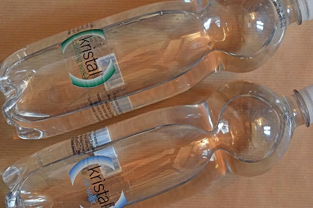
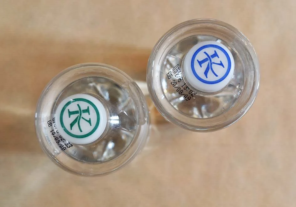
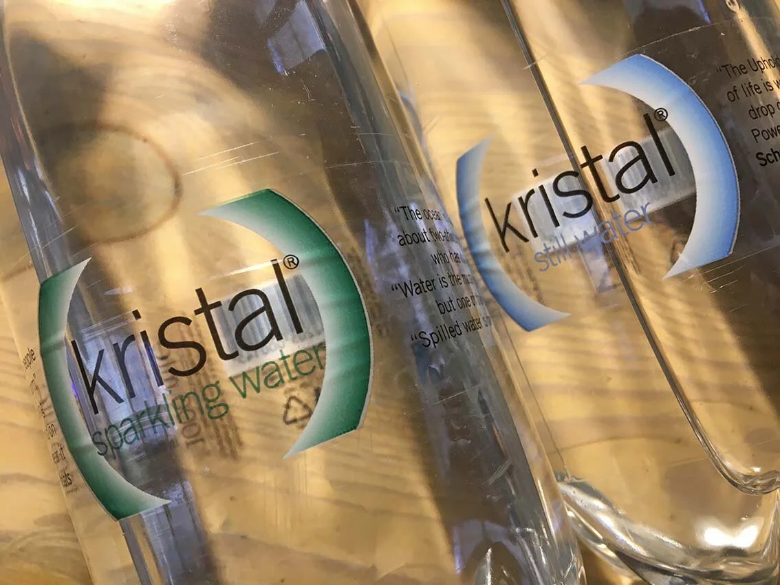
Kristal Water
PET bottles
Kristal Water is the local range of mineral water bottled by General Soft Drinks. Around 20 years ago, the desire to rebrand Kristal was expressed, and the idea was immediately that of doing something with the design that linked the name of the product to the fact that it represents ‘crystal clear’. The recommendation that the labels should be printed on transparent material as opposed to paper hit the mark immediately, and until the present day, Kristal is still bottled in the same bottles, with the same labels - looking as fresh as it ever did. Later on, the manufacturers decided to create a range of bottles - including a sparkling water alternative - which was slightly smaller in volume, and which looked more distinct. Again, the design of this, including the shape of the actual bottle, was created to manifest clarity and purity.
Kristal frutaqua range
PET bottles
Another project related to the Kristal water one, was the design of a set of labels linked to a range of fruit flavoured waters. To keep on the same idea of the original water bottle, the labels were printed on transparent pvc. The bottle caps were selected to match the predominant colour of each label - according to the flavour it represented. These labels are still used till this present day, almost two decades later.


Montekristo
Various
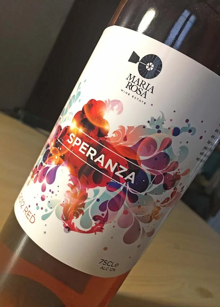
A range of labels was also designed for Montekristo. These included a classic wine collection (which was never produced), a range of wines called ‘Falconridge’, and a lager bottle which was called ‘Caqnu’ lager. These products are not available any longer on the market.

Other Packaging
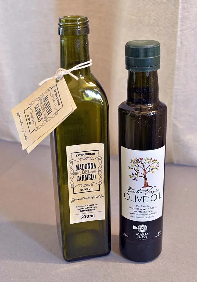
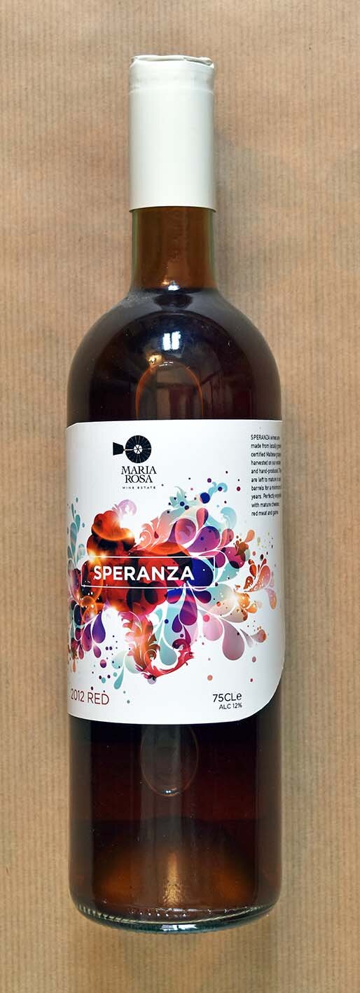
Our love for packaging, and for creating the best looking outfits for your products goes beyond. We have designed wine labels, olive oil labels, food packaging and even other product packaging. It is our pleasure indeed.


